

A lot of outbound teams are staring at the wrong dashboard right now.
The campaign says messages were delivered. The sequencer says volume is steady. Nothing looks broken until replies dry up, meetings fall off, and someone finally checks seed accounts or provider data and realizes the mail has been drifting into spam or vanishing into lower-priority folders for days. By then, the damage isn't just one weak sequence. The sending domain has started building a reputation problem.
That's why email deliverability metrics matter as a triage system, not a reporting layer. Some metrics tell a team where the email landed. Some explain why mailbox providers stopped trusting the sender. Some warn that trouble is coming before placement fully collapses. And some sit at the infrastructure level, where one bad authentication setup can undercut everything above it.
Cold email programs don't need more charts. They need the handful of email deliverability metrics that trigger the right operational decision fast enough to protect pipeline.
The Hidden Cost of Tracking the Wrong Metrics
A familiar pattern shows up in underperforming outbound programs. The team reports healthy delivery for months, assumes the infrastructure is fine, and keeps sending because nothing in the main dashboard looks alarming. Meanwhile, replies soften, then halve, then disappear across one provider segment first and the rest later.
The root problem usually isn't effort. It's metric selection.
Delivery rate is a weak comfort metric when used alone. A mailbox provider can accept the message, count it as delivered, and still route it somewhere that no buyer will ever see. That gap is where cold email programs lose momentum. Pipeline drops later, but reputation damage starts earlier.
Practical rule: If a metric can stay green while inbox visibility is getting worse, it's not a primary triage metric.
Teams get trapped by vanity reporting here. A dashboard full of sends, deliveries, opens, and broad campaign summaries feels operational. It isn't. It's lagging, incomplete, and often blind to provider-level filtering.
A stronger operating model treats deliverability metrics the way an incident team treats system alerts. Each number needs to answer a practical question:
- Placement question: Did the message reach the inbox?
- Reputation question: Did mailbox providers trust the sender?
- Engagement question: Did recipients behave in ways that help or hurt future placement?
- Infrastructure question: Did authentication and domain alignment hold up?
When those four layers are separated, the response gets cleaner. A bounce spike points to list quality. A complaint spike points to offer, targeting, or send behavior. An authentication failure points to configuration drift. A placement drop with stable delivery points to filtering that an ESP dashboard won't show.
The difference between a leading indicator and a lagging one decides whether a team fixes the issue this week or spends the next month trying to recover a burned domain.
Four Categories of Email Deliverability Metrics
Most outbound teams lump every signal into one reporting view. That makes diagnosis slower. A better system sorts email deliverability metrics into four categories based on the decision each one drives.
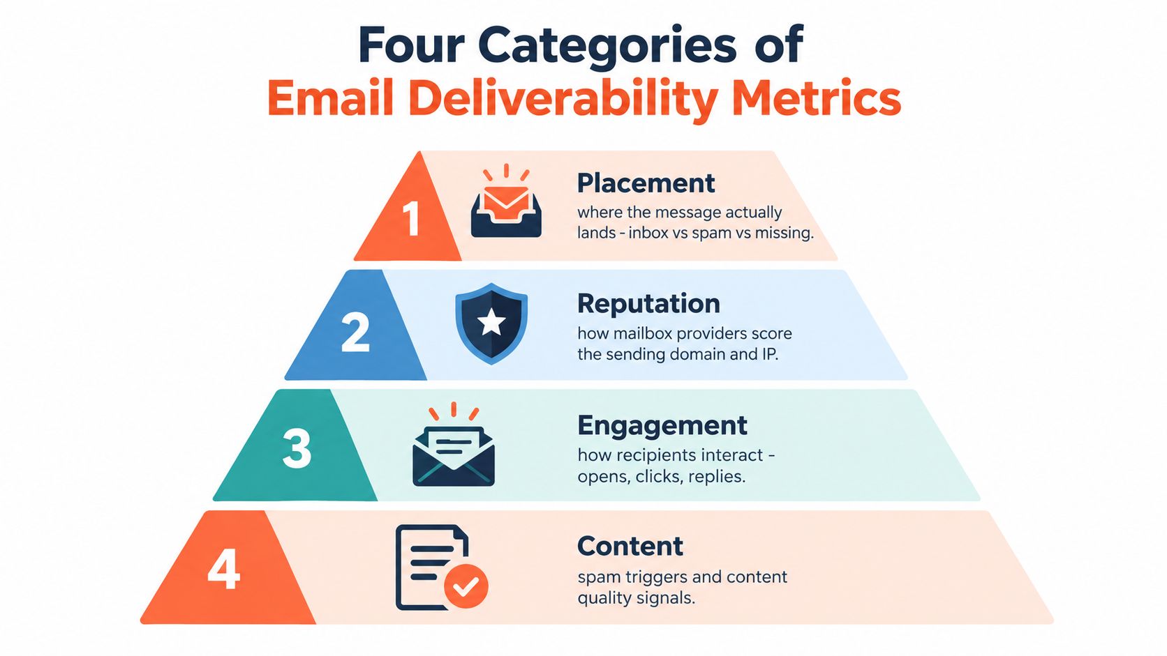
Placement metrics show the outcome
Placement metrics answer the only question prospects care about. Did the email land somewhere visible?
Inbox placement, spam placement, promotions routing, and missing mail all sit here. These are outcome metrics. They tell a team what happened after the message left the sender's system and hit the receiving provider.
If placement is weak, the response usually starts with provider segmentation, seed testing, and a review of reputation or authentication signals underneath.
Reputation metrics explain trust
Reputation metrics sit one level below placement because they influence how mailbox providers score the sender over time.
This category includes complaint patterns, bounce behavior, trap exposure, and domain or IP reputation aggregates. Reputation doesn't tell a team where one specific message landed. It tells them whether future sends are moving toward easier inbox access or heavier filtering.
A team can write strong copy and still lose if reputation has already slipped.
Engagement metrics warn early
Engagement metrics work as leading indicators when interpreted carefully. Replies, meaningful opens, clicks, and negative interactions tell providers whether recipients treat the email as wanted correspondence or nuisance mail.
Low engagement doesn't always mean copy is bad. In cold email, it often means a team should ask two questions at once: is the offer missing, or is placement already weakening?
Positive engagement helps future deliverability. Negative engagement does the opposite, often faster than teams expect.
Infrastructure metrics set the floor
SPF, DKIM, DMARC alignment, and related authentication checks form the base layer. If this part is unstable, every campaign above it is operating with a handicap.
A simple way to think about the stack:
- Infrastructure decides whether the sender looks legitimate.
- Reputation decides whether providers trust that sender.
- Placement shows the visible outcome.
- Engagement predicts whether the next wave gets easier or harder.
That sequence matters. Teams that skip straight to subject lines and CTA tests while authentication is drifting are optimizing the wrong layer.
Inbox Placement Rate and Global Inbox Placement
A cold email program can look fine in the sequencer and still miss pipeline because the mail never reached the inbox.
Inbox placement rate measures how often messages show up in the inbox rather than spam, category tabs, or disappearing into low-visibility states after provider acceptance. For operational reviews, this is one of the few metrics that maps directly to whether prospects had a fair chance to see the message.
Validity's benchmark, cited in Mailreach's summary of email deliverability statistics, reported an average global inbox placement rate of 87.2% for 2025 and a 3.7% year-over-year increase. Even with that improvement, 12.8% of legitimate marketing email still missed the inbox.
That gap is big enough to change outcomes.
Global placement is a summary, not a diagnosis
A global inbox placement number helps with board slides and top-line reporting. It does very little for daily triage. Blended rates hide where the failure sits, and cold programs usually break at the provider level first.
I have seen teams pause copy tests, rebuild sequences, and swap CTAs when the issue was isolated to one mailbox family. Gmail held steady. Microsoft filtered aggressively. The blended average softened the drop, so the team chased the wrong fix for two weeks.
Provider-level review is what turns this metric into an operating tool. If placement falls at one provider and holds at others, the response is different from an across-the-board decline.
What each destination means operationally
Not every non-inbox result deserves the same response. Folder placement tells you what kind of problem you are dealing with and which lever to pull first.
| Destination | What It Usually Signals | First Operational Response |
|---|---|---|
| Inbox | Current trust is holding | Maintain volume discipline and watch engagement |
| Spam | Filtering pressure tied to reputation, targeting, or message pattern | Cut volume, check complaint signals, review segmentation and recent copy changes |
| Promotions or category tab | Lower visibility, but not the same severity as spam | Decide whether visibility is still acceptable for the program type |
| Missing | Throttling, silent filtering, or provider-specific suppression | Validate with seed tests and provider-level monitoring before changing campaign logic |
For cold outbound, missing is often the most frustrating state. The message was accepted, but the sender cannot reliably confirm where it ended up. That usually calls for better testing, not guesswork.
Use placement as a triage trigger
Placement becomes useful when it forces a decision.
If global placement dips but Gmail, Outlook, and Yahoo all move together, start with recent sending behavior, authentication drift, or broader list-quality issues. If only one provider drops, isolate that provider in reporting, reduce pressure there first, and avoid making account-wide changes that can disrupt healthy traffic elsewhere.
A single blended number belongs in executive reporting. The metric that keeps cold email programs out of trouble is inbox placement by provider family, tracked over time, tied to an action threshold. That is the difference between watching a dashboard and catching a pipeline problem early.
Delivery Rate Versus Inbox Placement Rate
This is the pair that confuses more outbound reporting than anything else.
Delivery rate tells a team whether the receiving server accepted the email. Inbox placement rate tells them whether the accepted email landed somewhere a prospect is likely to see it. Those are not close substitutes.
Why the dashboard can mislead
A campaign can show a delivery rate of 99% and still be failing operationally. Here's the practical version. If a sender pushes 1,000 emails and 990 are accepted by receiving servers, the dashboard may look healthy. But if only 700 of those delivered messages reach the inbox and the rest go to spam or low-visibility folders, inbox placement is only 70%.
That means the campaign looked healthy in the sequencer while nearly a third of accepted mail had little or no pipeline value.
ESP dashboards often miss this because they usually measure up to provider acceptance, not post-acceptance filtering. They know whether a message bounced. They don't reliably know whether Gmail or Outlook later treated it as spam.
The metric that should win the argument
For cold programs, inbox placement should outrank delivery in weekly review meetings. Delivery is still useful, mainly because bounce spikes expose list or infrastructure problems. But delivery alone can't confirm visibility.
A cleaner comparison looks like this:
| Dimension | Delivery Rate | Inbox Placement Rate |
|---|---|---|
| What it measures | Whether the receiving server accepted the message | Whether the accepted message reached the inbox |
| What it misses | Post-acceptance spam filtering and category routing | Direct cause of filtering |
| Best use | Detecting bounce and send-acceptance issues | Measuring real inbox visibility |
| Common reporting mistake | Treated as proof that email is “getting through” | Ignored because it requires seed testing or provider-level diagnostics |
When delivery stays stable and replies fall sharply, placement should be the first suspect before copy gets blamed.
A team that optimizes for delivery can congratulate itself while burning a domain. A team that optimizes for inbox placement sees the battlefield sooner.
Bounce Rates That Signal List-Quality Issues
A cold campaign can show a strong delivery rate and still be poisoning the next send. Bounce rate is often the first metric that explains why. It sits close to the top of the triage stack because it points to a concrete operational decision: clean the list, slow the segment, or inspect provider-specific friction before reputation damage spreads.
The practical thresholds are simple. Bounce rates above about 2% usually point to list-quality trouble. Stronger programs also try to keep hard bounces under 0.3%, soft bounces under 1%, and total bounces under 1.5%, as noted earlier.
Hard bounces require list action, not copy changes
A hard bounce is a permanent failure. In cold email, that usually means the address is invalid, stale, or was never usable for this sender. If hard bounces rise, the problem is rarely creative or timing. The problem is data quality.
Treat hard bounces as a stop signal for the affected segment. Continuing to send tells mailbox providers that acquisition standards are loose and suppression rules are sloppy.
The response should be procedural:
- Pause the segment: Contain the issue before it contaminates recent domain history.
- Re-verify the source list: Enrichment output and old CRM exports both fail more often than teams expect.
- Suppress bad records: Remove invalid, duplicate, and role-based addresses where they do not belong in the campaign.
- Audit list acquisition: Scraped, purchased, or aging data usually shows up here first.
If the program lacks a defined hygiene step, start with a process for cleaning an email list before launch. Fixing this after a reputation dip is slower and more expensive.
Soft bounces point to pressure, throttling, or early distrust
A soft bounce is temporary, but it should not be ignored. Mailbox full errors happen. So do server hiccups. In cold outbound, repeated soft bounces often mean the provider is deferring mail because send volume, domain age, or recent behavior has moved out of bounds.
Bounce rate stops being a vanity metric and starts acting like triage. Hard bounces trigger list cleanup. Soft bounces trigger send-pattern review.
If soft bounces cluster at one provider, reduce pressure there first. Cut daily volume, widen send windows, and check whether a new domain, mailbox pool, or campaign launch created the spike. If soft bounces are spread across providers, review infrastructure and recent warm-up changes before blaming the list.
| Bounce Type | Threshold | What it usually signals | Operational decision |
|---|---|---|---|
| Hard bounce | Above about 0.3% is a warning. Above about 2% is a list-quality problem | Invalid, stale, or badly sourced addresses | Pause segment, re-verify source, suppress bad records |
| Soft bounce | Strong programs often keep this under 1% | Temporary deferrals, throttling, provider trust friction | Reduce volume, inspect provider pattern, review recent sending changes |
| Total bounce | Strong programs often keep this under 1.5% | Mixed list and infrastructure issues | Split the problem by source, segment, and provider before resuming scale |
Bounce metrics matter because they tell you what to do next. A hard-bounce spike means stop feeding bad data into the system. A soft-bounce spike means check sending pressure and provider response before inbox placement drops harder in the following week.
Complaint Rates and Reputation-Damage Signals
A cold campaign can look stable at noon and be in trouble by Friday because complaint rate got ignored on Tuesday.
Complaints are the metric that forces action fastest. A bounce points to bad data or provider friction. A spam complaint tells a mailbox provider that a real recipient wanted the mail out of their inbox and took the strongest built-in action available. In operational terms, that puts complaint rate near the top of the triage queue for any cold email program.
Mailbox providers themselves set the tone here. Google's bulk sender guidance says to keep reported spam rates below 0.3% in Postmaster Tools, which gives teams a practical ceiling before reputation damage starts getting harder to reverse.
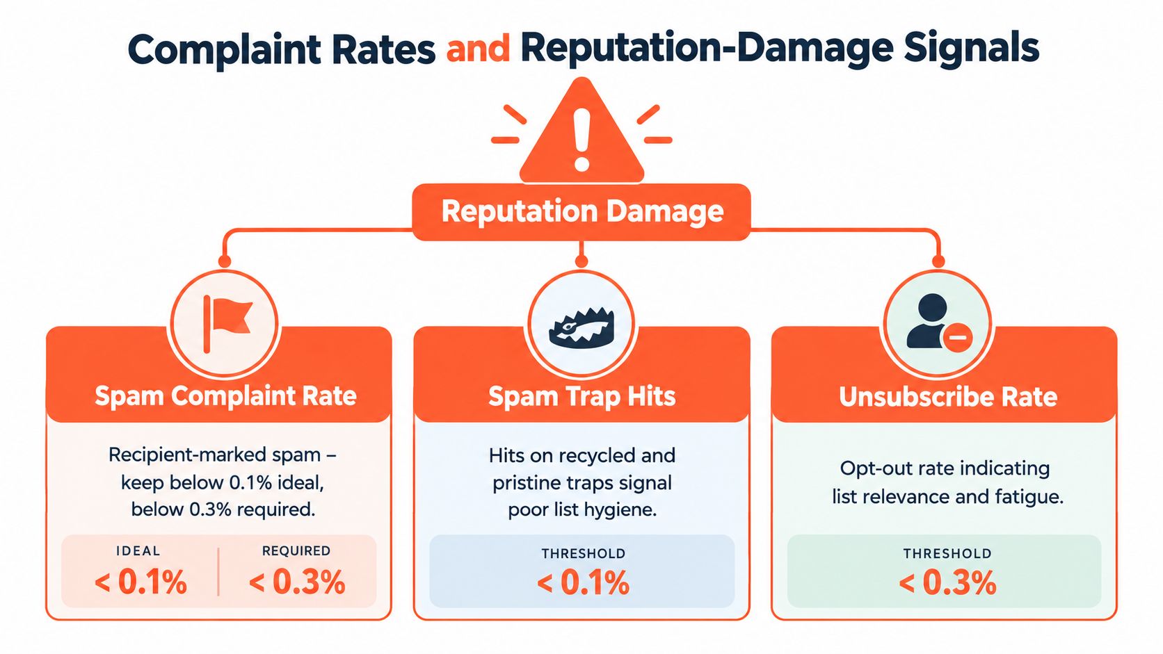
Complaint rate is the metric that changes the send plan
Once complaints rise, treat it as a pipeline risk, not a reporting footnote. The question is not whether the dashboard still looks acceptable. The question is what to stop, cut, or isolate before inbox placement drops further.
Use complaint signals to make specific decisions:
- Reduce volume on the affected domain or mailbox pool. Continuing at the same pace usually turns a warning into filtering.
- Pause the segment driving complaints. Bad targeting creates more damage than weak copy because the wrong audience keeps producing the same negative signal.
- Review follow-up cadence. A sequence that is tolerable at touch one can start generating spam reports by touch three or four.
- Split by provider. If complaints are concentrated at Microsoft or Google, adjust there first instead of throttling the whole program blindly.
- Check recent changes. New copy, a fresh list source, added mailboxes, or a sudden ramp in daily volume often explains the spike.
I have seen teams rewrite an entire sequence when the issue was list fit inside one segment. Complaint rate keeps that mistake from wasting another week.
A complaint spike usually means the sender missed on audience, timing, or frequency. Sometimes all three.
Trap hits and unsubscribes answer different questions
Spam traps point to sourcing and hygiene failures. Pristine traps usually mean the acquisition path was bad from the start. Recycled traps usually mean old records stayed in rotation too long. Both hurt reputation, but the fix is different. One calls for source review. The other calls for tighter suppression and list-aging rules.
Unsubscribes are a weaker reputation signal than spam complaints, but they still belong in the same triage view. Rising unsubscribes often show that message fit is slipping before recipients start marking mail as spam at higher rates. For cold programs, that makes unsubscribe trend useful as an early operational warning, especially when it rises in the same segment that later produces complaints.
Read these signals together. Complaint rate tells you where recipient frustration is already visible. Trap hits tell you whether list acquisition or decay is poisoning the program. Unsubscribes show where relevance is wearing thin. That combination is more useful than a reputation dashboard full of isolated numbers because each metric maps to a different action, and each action affects whether future pipeline email reaches the inbox at all.
Engagement Metrics as Leading Indicators
Engagement metrics get misused all the time in cold email. Teams often treat them as copy report cards when they're more useful as early warnings for placement movement.
The hierarchy matters. A fall in engagement can mean bad messaging. It can also mean good messaging that fewer people are seeing because inbox placement is slipping. The job is to separate those two.
Replies matter more than vanity opens
Reply rate is the cleanest engagement signal in cold outbound because it reflects deliberate human action. Positive replies help confirm that the targeting and message are acceptable to real recipients. Negative replies can be just as informative because they often show that the sender reached a real person, even if the offer missed.
Open rate is weaker than it looks. Privacy protections and image prefetching make opens noisy, and total opens are especially easy to overread. Unique opens are somewhat cleaner directionally, but they still shouldn't be treated as proof of healthy inbox placement on their own.
Click rate can help in some outbound setups, especially when the campaign is intentionally driving to a relevant asset. But click-focused cold email can also introduce extra friction if the ask arrives too early.
How teams should actually use engagement
A practical way to read engagement metrics is as a sequence of questions:
- Replies fell first: Check placement before rewriting everything.
- Opens fell with replies: Visibility may be deteriorating.
- Opens held but replies dropped: The message or audience fit may be weakening.
- Negative replies increased: Relevance, cadence, or tone may be pushing recipients away.
A lot of teams chase engagement after the fact. Better teams use it as a leading indicator. If replies and meaningful interaction sag across one provider or one sending domain, intervention should start there before broad volume expansion makes the problem larger.
Authentication Metrics After the 2024 Enforcement Shift
Authentication used to be treated like setup work. Now it's an operating requirement.
Mailgun's 2025 deliverability report found that 23% of senders believed the new Gmail and Yahoo requirements caused deliverability challenges, and nearly 80% of affected senders updated authentication practices in response, according to The Digital Bloom's summary of the Mailgun report. The same source notes that DMARC adoption increased by more than 11%, yet only 25.5% of DMARC users planned to enforce a stricter policy and only 13% of senders used inbox placement testing.
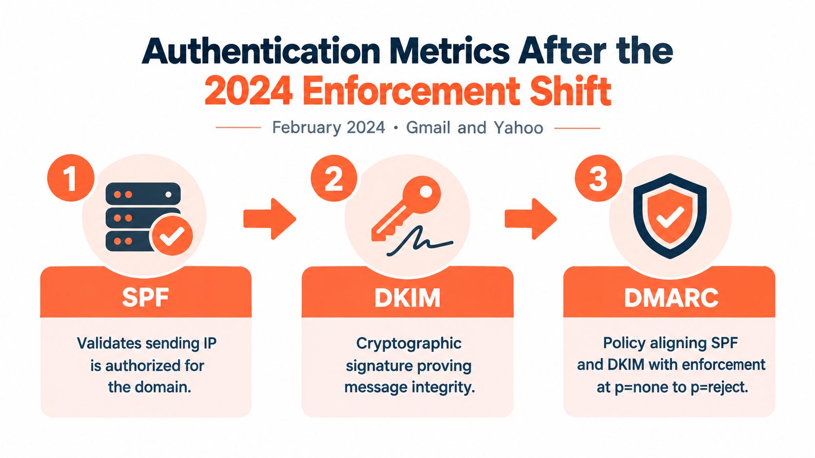
SPF, DKIM, and DMARC do different jobs
The core authentication layer is well defined in the NIST guidance on SPF, DKIM, and DMARC.
- SPF identifies which systems are authorized to send for a domain.
- DKIM signs the message so receivers can verify integrity and identity.
- DMARC ties those checks to the visible From domain through alignment and gives the sender policy and reporting control.
The key operational lesson is that these aren't interchangeable checkboxes. SPF can fail in forwarding or certain subdomain scenarios while DKIM still validates. DMARC is what tells the receiver whether the visible sender identity aligns cleanly enough to trust.
Alignment is the metric that matters
Cold outbound teams often stop at “SPF passed” or “DKIM passed.” That's incomplete. What mailbox providers care about operationally is whether the authenticated identity aligns with the visible From domain under DMARC rules.
A DMARC policy usually progresses through three states:
- None: Monitor failures without instructing receivers to act.
- Quarantine: Tell receivers to treat failing mail with caution.
- Reject: Tell receivers to reject failing mail.
That progression lets operators monitor before tightening policy. When DNS or sending setup changes, alignment checks should be retested immediately. Teams that need a clearer operational breakdown of each layer can use this guide to SPF, DMARC, and DKIM explained for cold email.
Authentication isn't the whole deliverability story. But when it's weak, every other metric gets harder to trust.
Sender Score and Domain Reputation Aggregates
Aggregate reputation views are useful, but mostly as confirmation signals.
A sender score, domain reputation panel, or provider-level trust rating compresses multiple underlying behaviors into one broad judgment. That can help a team spot trend direction quickly. It doesn't replace the source metrics that caused the shift.
Domain matters more than teams think
In modern cold outbound, domain reputation usually deserves more attention than raw IP reputation. Providers increasingly evaluate the visible sending identity, recent behavior, complaint patterns, and consistency associated with the domain the recipient sees.
Google Postmaster Tools is useful for Gmail-facing diagnostics because it exposes domain reputation categories such as High, Medium, Low, and Bad. Microsoft SNDS gives visibility into Outlook and related traffic patterns from Microsoft's side. Third-party tools like Sender Score and Talos can add outside perspective, though they should be treated as approximations rather than the provider's internal truth.
Aggregates lag the underlying problem
The biggest mistake with aggregate reputation metrics is timing. They often move after the root issue has already started affecting pipeline. If complaints rose, bounces climbed, or placement slipped earlier in the week, a domain reputation downgrade may only show up after those signals have already done damage.
| Source | Scale or Rating | Primary Inputs |
|---|---|---|
| Google Postmaster Tools | High, Medium, Low, Bad | Gmail-facing domain trust, spam behavior, authentication health |
| Microsoft SNDS | Provider-side traffic and reputation indicators | Outlook and Microsoft ecosystem behavior, complaints, filtering patterns |
| Sender Score | Third-party aggregate score | Broad reputation signals gathered from external data sources |
| Talos | Reputation view and classification context | Observed sender behavior and reputation patterns |
That's why these aggregates should sit lower in the triage stack than placement, complaint, and bounce signals. They're helpful for confirming that the providers have noticed the same problem. They're not fast enough to serve as the first alarm.
How to Measure These Metrics With the Right Stack
A deliverability stack should answer three questions without guesswork. Where did the message land, who reacted badly to it, and what changed in the sender's trust signals? If a tool can't answer one of those, it probably belongs in a secondary role.
Match the tool to the metric
Seed testing tools such as InboxAlly, GlockApps, and Mailreach help estimate placement across provider mixes. They're useful before a new launch, after a noticeable engagement drop, and any time a sender rotates infrastructure or list sources. Teams that want a practical walkthrough can use this guide on how to test email deliverability before scaling.
Google Postmaster Tools should sit in the stack for any domain with enough Gmail activity to produce usable data. It helps surface Gmail spam rate, domain reputation, and authentication status. Microsoft SNDS fills the same role on the Microsoft side, where Outlook filtering often behaves very differently from Gmail.
ESP analytics still matter. They're the easiest place to watch delivered volume, opens, clicks, replies, and bounce patterns at the campaign level. They just shouldn't be treated as placement truth.
A practical operating stack
| Tool | What It Measures | When To Use It |
|---|---|---|
| Seed testing platform | Inbox, spam, and category placement across providers | Before launches, after performance drops, during infrastructure changes |
| Google Postmaster Tools | Gmail-facing reputation, spam-rate, and authentication signals | Ongoing domain monitoring for Gmail traffic |
| Microsoft SNDS | Microsoft ecosystem delivery and reputation visibility | Ongoing Outlook and Microsoft monitoring |
| ESP analytics | Sends, delivered volume, opens, clicks, replies, bounces | Daily campaign diagnostics |
| Managed outbound operator | Infrastructure setup, monitoring, and response workflows | When the team needs execution support alongside reporting |
For a broader benchmark view of campaign reporting beyond raw deliverability, this email marketing metrics KPI reference is a useful companion because it helps separate pipeline-relevant metrics from vanity ones.
Some teams also use a managed provider to own parts of the stack. Eludic is one example. It handles cold email infrastructure, deliverability management, monitoring, and reply operations as part of a done-for-you outbound service.
The important part isn't the brand list. It's that the stack combines placement testing, provider-native diagnostics, and campaign analytics instead of asking one dashboard to do all three jobs.
Quick Reference and Operational Decision Checklist
This is the table worth pinning next to the outbound dashboard. Each metric should trigger an action, not another meeting.
| Metric | Threshold | Triggered Action |
|---|---|---|
| Inbox placement | Meaningfully below normal seed results | Run a placement diagnostic by provider, then inspect authentication, list source, and recent copy changes |
| Hard bounce rate | Above about 0.3% is a warning, above about 2% is a list-quality problem | Pause the segment, verify data, suppress bad records |
| Soft bounce rate | Sustained rise above normal operating range | Check provider-specific throttling, reduce pressure, inspect domain trust signals |
| Total bounce rate | Above about 1.5% indicates weak list discipline | Review sourcing and hygiene before sending further |
| Spam complaint rate | Above roughly 0.3% is critical | Reduce volume, audit targeting and message relevance, protect the domain before scaling again |
| DMARC alignment failures | Any clear rise from normal baseline | Audit sender identity consistency across visible From domain and authentication setup |
| Reply rate | Sustained decline without a list or offer change | Check placement first, then test messaging and audience fit |
A healthy cold email program doesn't watch these metrics for curiosity. It uses them to decide when to pause, when to fix, and when it's safe to scale.
Eludic builds and runs cold email programs for B2B teams that need more than a sequencer and a list. That includes domain setup, authentication, deliverability monitoring, copy testing, reply handling, and booked meetings tied to pipeline outcomes. For teams that want the operational side handled properly, visit Eludic.